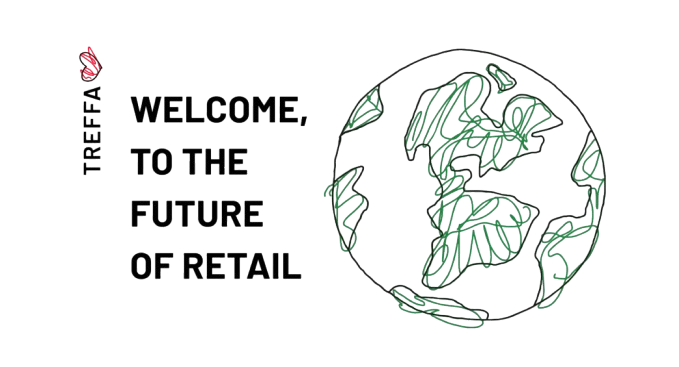
Treffa
During my first semester as a member of Innovative Design at USC, I contributed to the graphic design process for our client, Treffa. A slow fashion retail service that connects small businesses and creatives to customers for personalized clothes, artwork, and other goods.
DURATION
Sept 2023 - Dec 2024 (4 months)
ROLE
Graphic Designer
TEAM
4 Graphic Designers + 1 Team Lead
Overview
The Challenge
Our mission was to create cohesive logos and designs to enhance their branding, broaden their audience reach, and clearly communicate what Treffa offers to potential users.
Deliverables
• IOS App icon logo
• Design/logo of the word Treffa
• Font selection for word logo
Target Audience
Young adults (age 13-30) who love to buy items such as clothes and tangentially related objects such as perfume, room decor, furniture, etc. Treffa aims to eventually encompass all people who desire to buy things and need retail recommendations.
Client's Key Message
• Slow fashion: buying goods that matter or are what you’re specifically looking for
• Sustainability
• Ethical Retail
• Individuality
• Creativity
• Fresh and funky new perspectives
• Collaboration
MoodBoard


Our mood boards were heavily influenced by hand-drawn design elements as well as Treffa’s key message such as sustainability and ethical retail.
My mood board, distinguishable by its gray background, incorporates hand-sketched images of individuals adorned in various clothing items. It further emphasizes the theme of sustainability and recycling through the inclusion of hand-drawn illustrations, underlining the ethical aspects of retail. Finally, it encapsulates the retail experience with images of clothes displayed on hangers and scenes from shopping at outlets such as Goodwill.
Low-fi Sketches
Word Logos
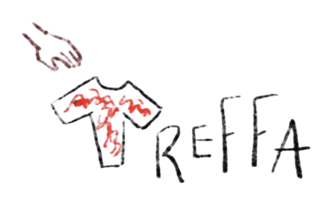
My first logo was inspired by Treffa’s main utility, a retail market place where people can go and buy clothes and items. To illustrate this, I chose to replace the “T” in “Treffa” with a shirt colored in red (one of Treffa’s current main colors) paired with a hand reaching for the shirt. The rest of the word logo is meant to be sans serif style text.

My second logo was to made to emphasize the phonetic characteristics of the word "Treffa". The distinct "T" and "f" sounds stand out when pronounced, and I wanted these elements to be reflected in the design. I also integrated a visual metaphor, featuring shoes draping over the left side of the logo, reminiscent of shoes hanging from power lines in residential areas.
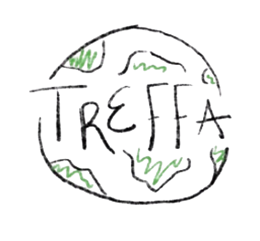
In my third logo, I highlighted the key themes of sustainability and ethical retail, both of which are cornerstones of Treffa's ethos. I crafted the logo in a clean sans serif style, encapsulating it within an earth-like circle. The landmasses of this globe were rendered in vibrant green, further emphasizing the brand's commitment to environmental responsibility.
App Logos

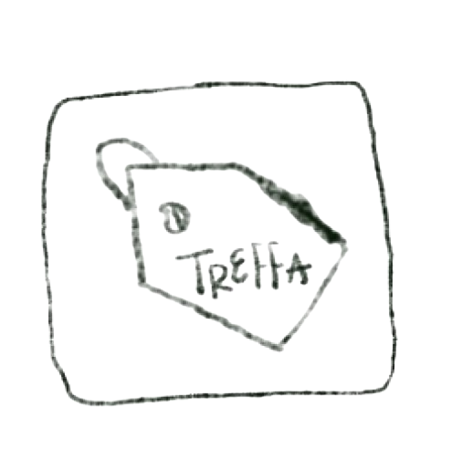
My initial sketch for the app logo was inspired by the tags attached to retail items. It communicates to users that Treffa is more than just a store - it's a dynamic marketplace where people can trade, purchase, and sell unique clothing and related items.
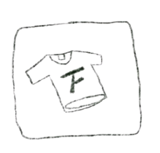
Another design concept for the app logo integrated an enhanced version of the word logo. This version cleverly combined the phonetic sounds of "T" and "F" in Treffa and superimposed it onto a shirt. This design once again emphasizes that Treffa is a vibrant marketplace for buying clothes and related items.
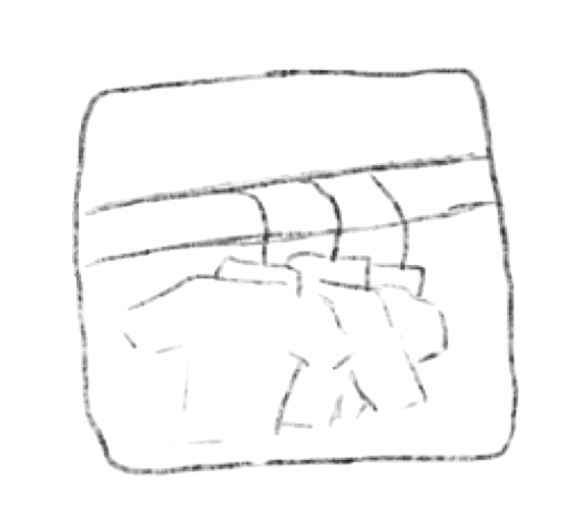
To provide a diverse array of options for the client in the lo-fidelity sketches, I devised an app logo that doesn't include the Treffa name. This concept resulted in a unique app icon featuring clothes on hangers, arranged in a style reminiscent of a second-hand thrift store.
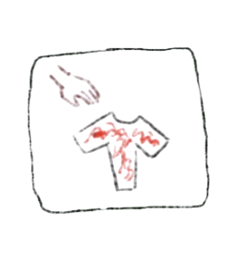
In this concept for the Treffa app, I retained the unique shirt and hand combination as the central visual element, replacing the surrounding text to simplify the design and make the iconography the main focus. This approach emphasizes the app's purpose—connecting users with clothing options in an intuitive way—by using recognizable and relevant symbols.
This design iteration for the Treffa mobile app takes inspiration from the second logo concept for the "Word Logos", again incorporating both the T and F of Treffa into one and integrating a visual metaphor.

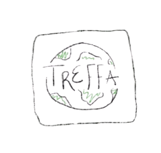
This design iteration takes inspiration from the third Treffa Word Logo, emphasizing the theme of sustainability and ethical retail
High-fi Sketch
Treffa's Favorite
Treffa approved of my Treffa logo that incorporated the hand and shirt that replaced the “T”.

For the final deliverable, they wanted something that looked a bit more professional without the hand while keeping in mind their color palette of red, black, and gray.

Final Deliverable
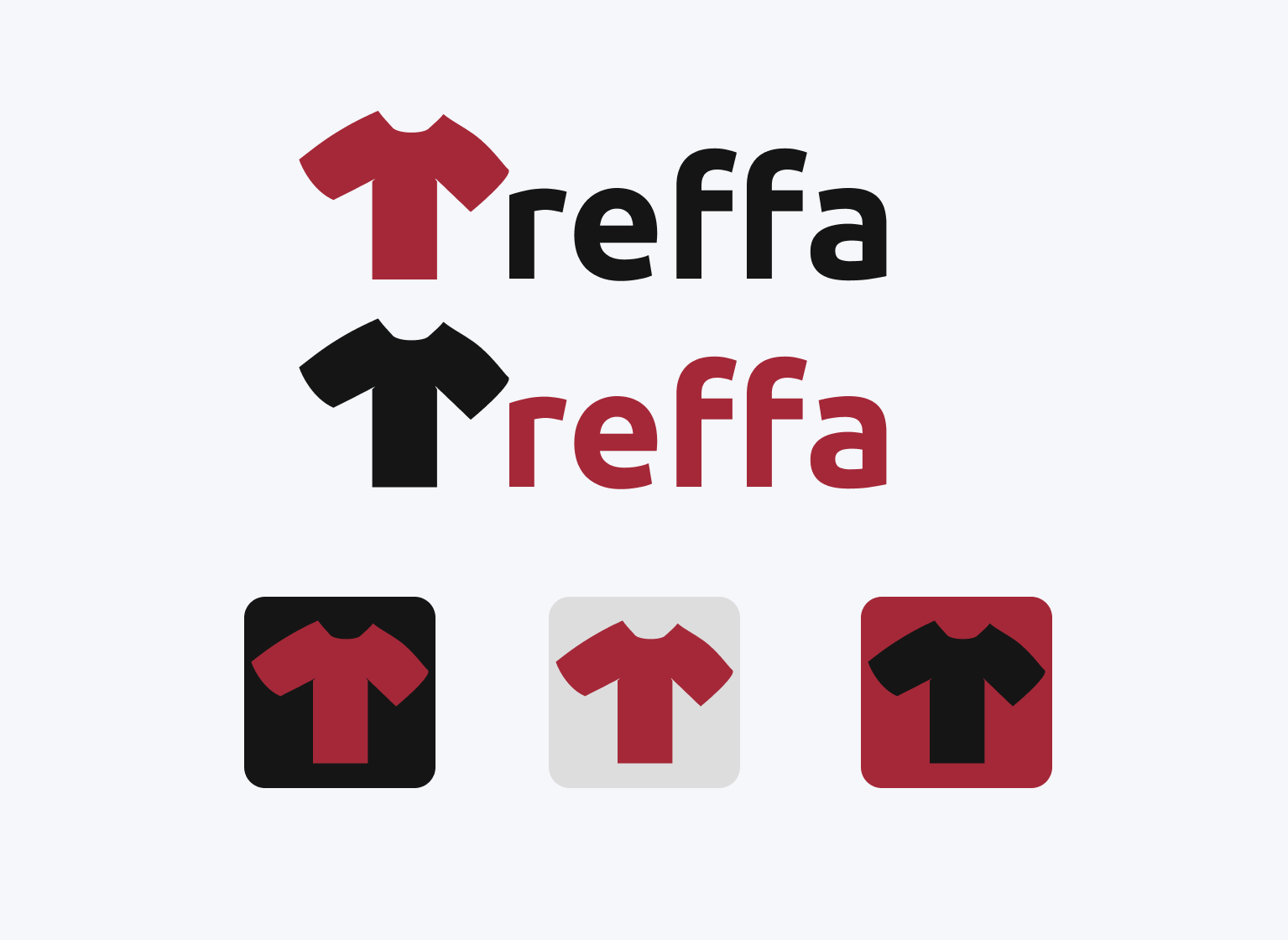
In the final deliverable for Treffa, I refined my initial low-fidelity sketch by using the shirt to represent the "T" in a more pronounced manner, while maintaining a sans serif style for the rest of the text. I deliberately slimmed the torso of the shirt to resemble a capital "T", seamlessly blending with the shirt sleeves. For the remaining text, I chose Ubuntu, a sans-serif typeface family, to ensure readability and visual consistency.
The app icons incorporate the shirt element from the word logo, presenting it against the backdrop of Treffa's color palette, thereby creating a coherent, visually appealing identity across different platforms.


