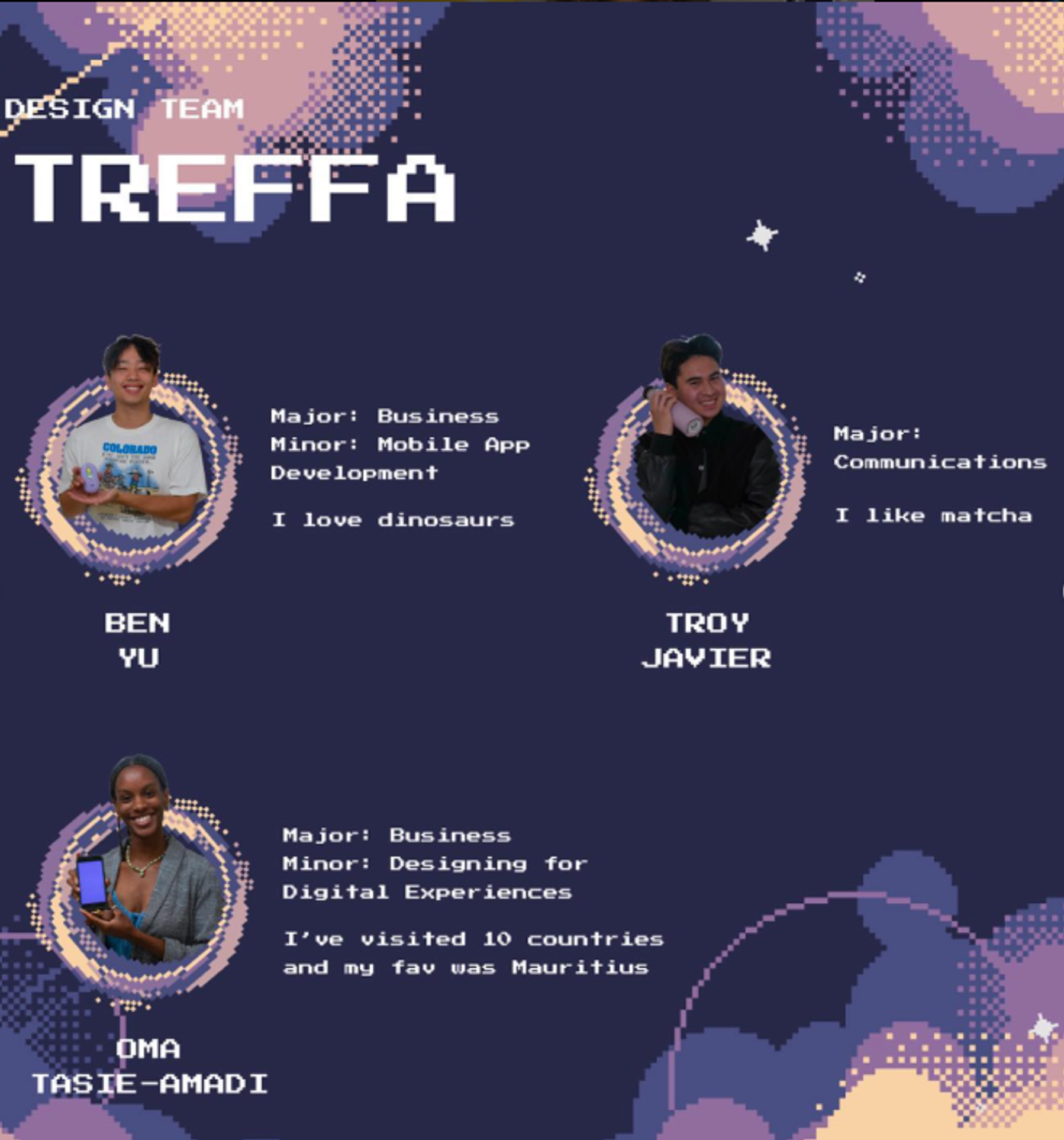
Innovative Design at USC
Innovative Design at USC is a student-run creative agency. They are a community of creatives delivering professional-level work to real world clients. Services include Graphic Design, Photography, and UI/UX Web Design.
DURATION
Sept 2023 - Current
ROLE
Graphic Designer/UX Designer
TOOLS USED
Figma, Pinterest, Zoom
Overview

The Challenge
The Prompy
For my application to Innovative Design at USC, I was tasked with completing their design challenge to showcase my creative thinking process and technical design skills.
Inno, an indie pop artist, is seeking a captivating poster to promote the tour dates for her new album which reflects her upbringing in Los Angeles. She has a strong preference for the color purple, which she wants to be prominently featured in the design, and a bold typography combination to showcase the vibes of her newest album.
Inspiration

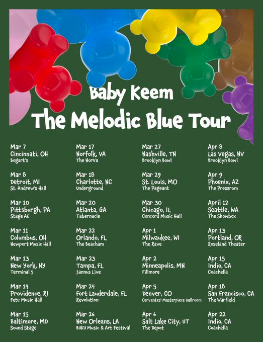
The tour poster that resonated most with me was for Baby Keem’s 'The Melodic Blue' Tour. It showcased an easy-to-follow layout with a clear visual hierarchy, prominently displaying Baby Keem’s name and the tour title in large, eye-catching text. This design choice effectively captured immediate viewer attention. Below the title, the poster listed the tour dates and locations in a funky yet legible font, balancing style with readability.
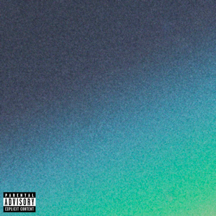
Following, I focused on selecting a color palette for the base of the poster, drawing inspiration from the 'Smithereens' album cover by Joji. I was captivated by the way the colors seamlessly blended into each other, enhanced by grainy effects that added a textured feel to the artwork. Despite its simplicity, featuring just three colors shading into one another, the design was very impactful. It perfectly encapsulated the mellow Lo-fi vibe of Joji’s music, making a profound visual statement.
Color Palette and Poster Base


#5E2E84
#71D1A7
Poster Base
For my poster, I used purple to meet the design prompt and chose a soft green, inspired by the Smithereens album cover, to complement Inno’s indie-pop style. The green contrasts nicely with the purple and aligns with Inno's unique musical identity.
I wanted to melt the purple and green colors together, similar to the Smithereens album cover while also using the Edit Noise & Texture plug in on Figma to help it add a bit of texture.

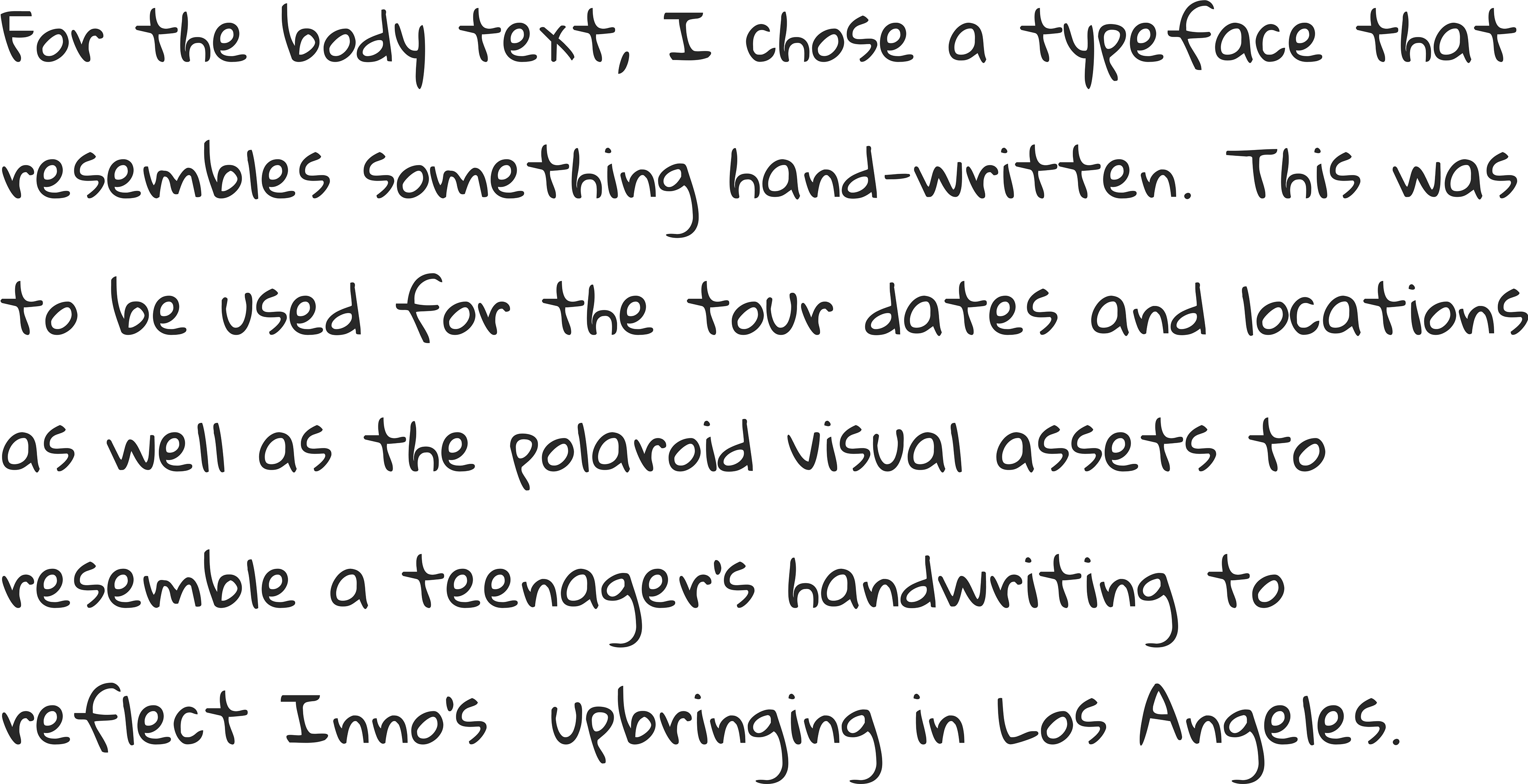
Typography and Visual Hierarchy
The design prompt called for a bold typography combination to capture the essence of Inno’s indie-pop style of music. To meet this requirement, I chose 3 distinct typefaces:


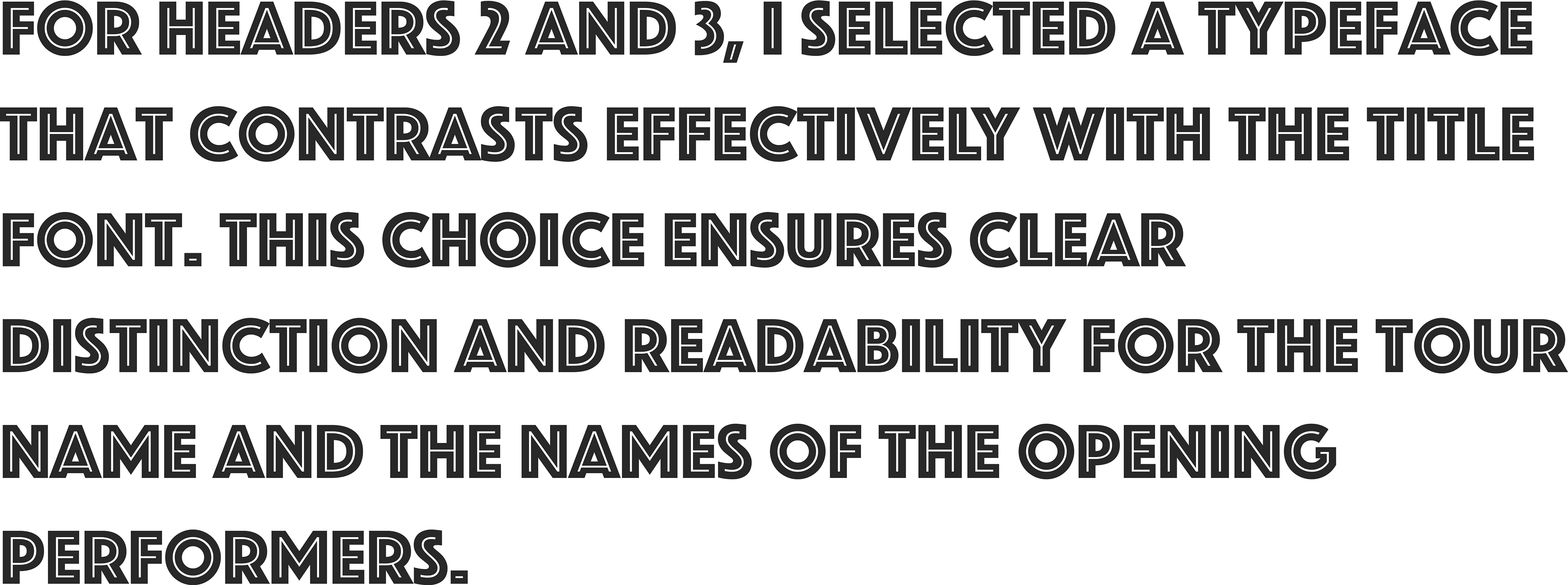

For the visual hierarchy of the poster, I utilized the vibrant green color to emphasize the title and header 1, creating a strong focal point. The text sizing was strategically chosen to guide the viewer's attention.
'Inno' was set at size 128 to stand out prominently, header 1 at size 48 to capture secondary attention, header 2 at size 28 for additional details, with the tour dates in size 20 and location information slightly smaller at size 14, ensuring each element is distinct yet part of a cohesive whole.
Visual Design Assets

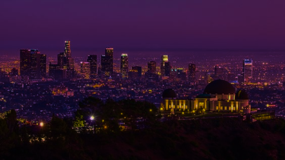
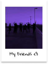
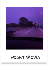
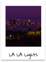
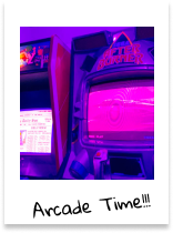
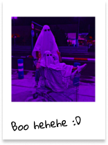
Another key element of the design prompt was to reflect Ino’s upbringing in Los Angeles in the poster for her new album tour. In order to include this in the poster’s design,
I began by thinking of ways to express the themes of childhood and Los Angeles.
I began to reflect back to my own childhood and teenage years and how I liked to explore my hometown with my friends and take pictures. These pictures now hang in my college apartment wall in the form of polaroids.
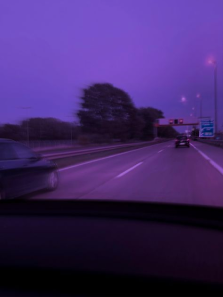
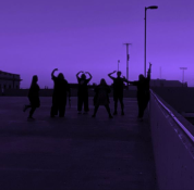
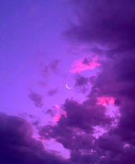
After this, I knew I wanted to include polaroids into the poster design. I began by searching up images with keywords of “purple” “teenager” and “Los Angeles”.
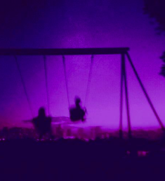
After sourcing the images, I began to design the polaroid design asset, following the structure of a white square with the image at the center with some scribbled text on the bottom. This worked well with the Gloria Hallelujah text to imitate a teenager’s handwriting.
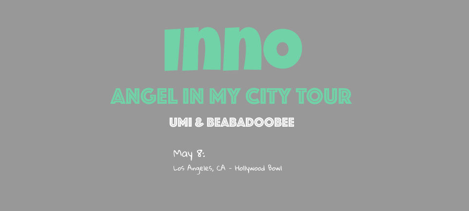
Final Deliverable
After combining the poster base, typography, color, hierarchy, and visual assets, below is my final deliverable for the Innovative Design Fall 2023 design challenge.
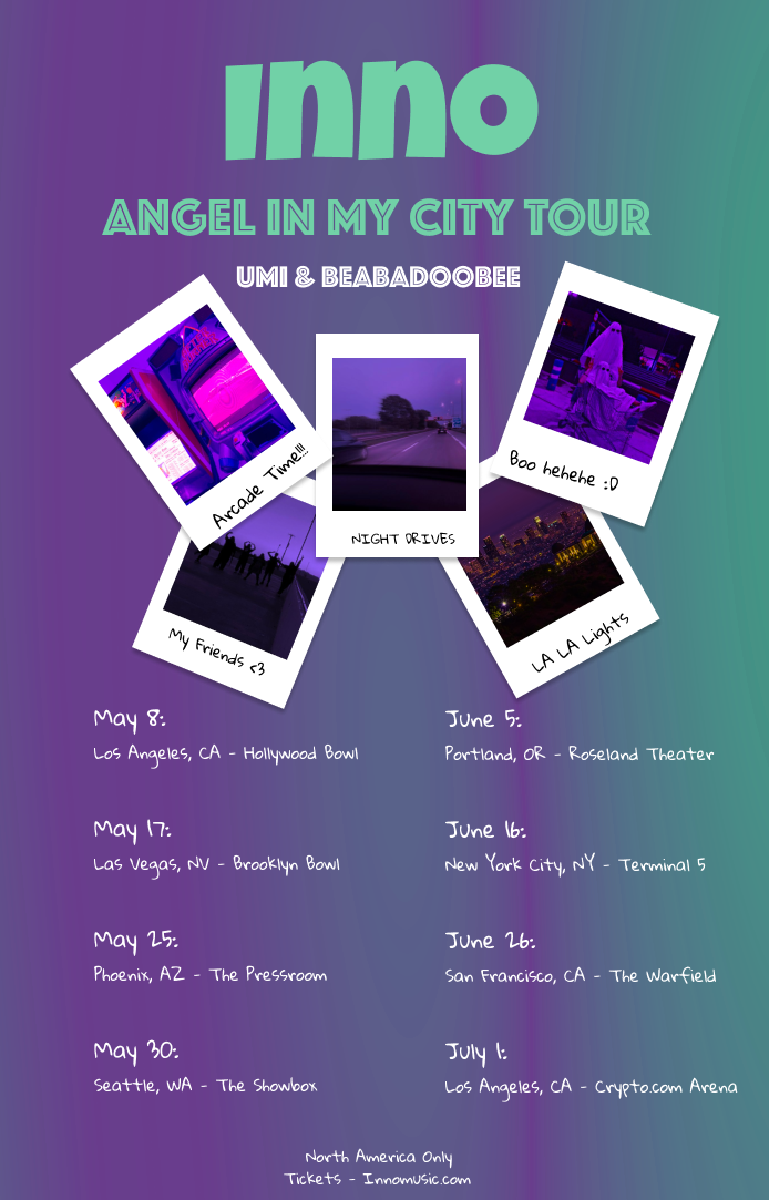
This final poster played a pivotal role in my acceptance into the Fall 2023 Purple Hex class at Innovative Design, a highly selective program with an acceptance rate of less than 15%.
Thank you for reading my Innovative Design Challenge case study!