Shades
Shades was my submission for CreateSC 2024, the annual designathon hosted by the University of Southern California's Innovative Design organization. Our solution aimed to enrich the music experience for those with hearing impairments. Our submission won us 2nd place out of 50 teams and a prize of $500.
DURATION
Apr 13 - Apr 14 (1 day Designathon - CreateSC)
ROLE
UI/UX Designer
TEAM
3 Designers
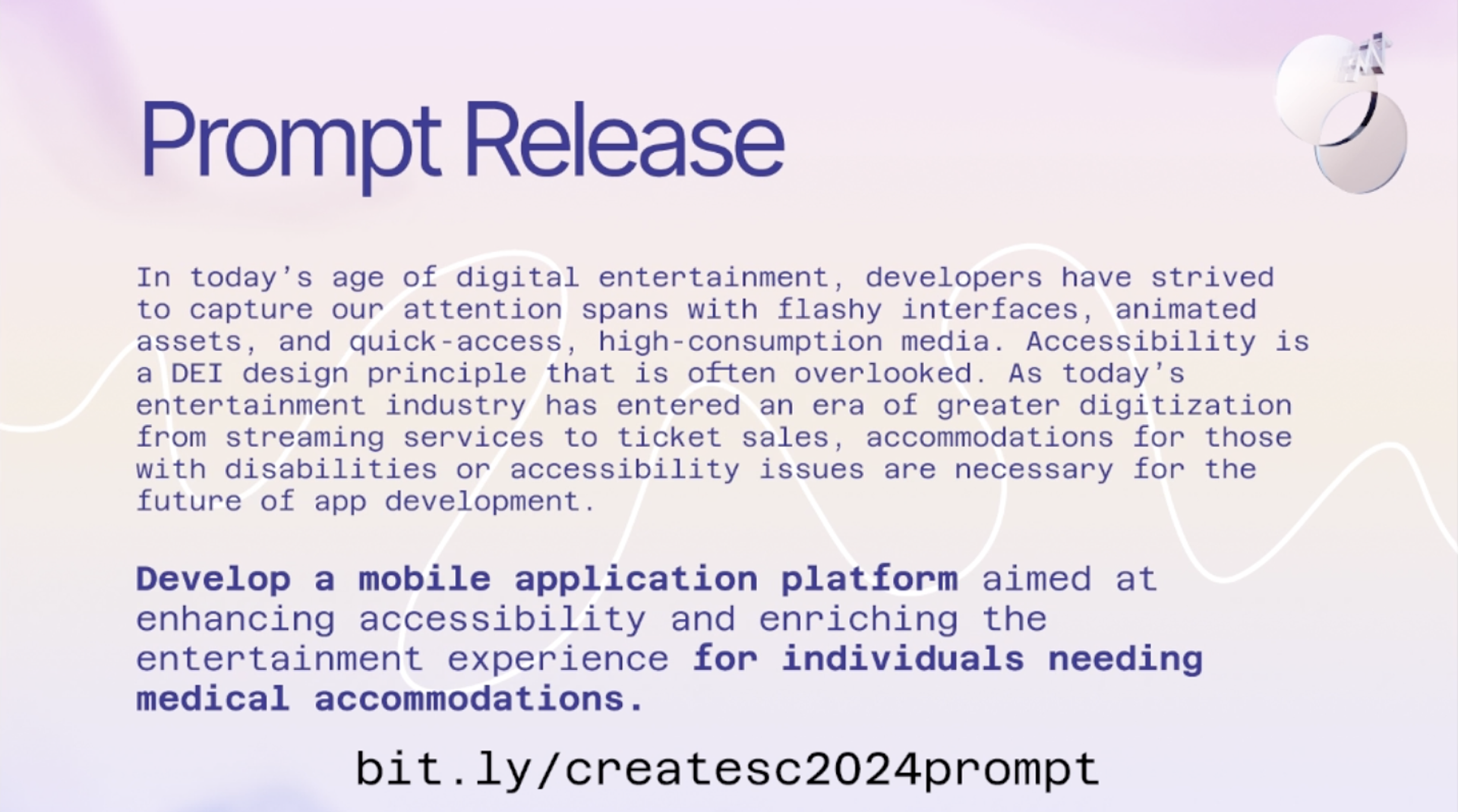
The Prompt

Idea Brainstorm
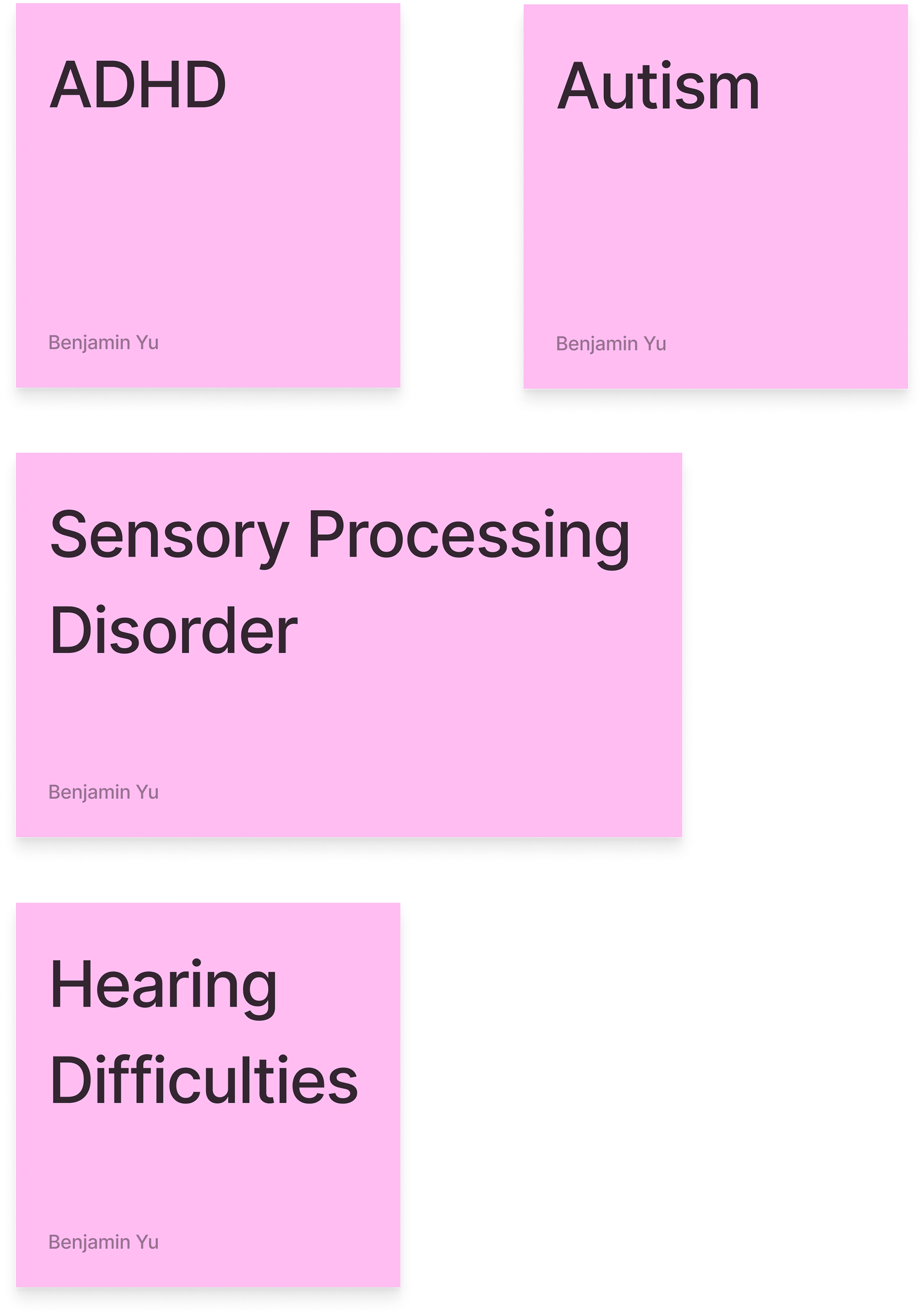
Special Needs to Address
After reading the CreateSC prompt and taking time to understand what was required of us, my team and I began brainstorming what types of special needs to target with our application. We decided to list a few out on Figjam to visualize:
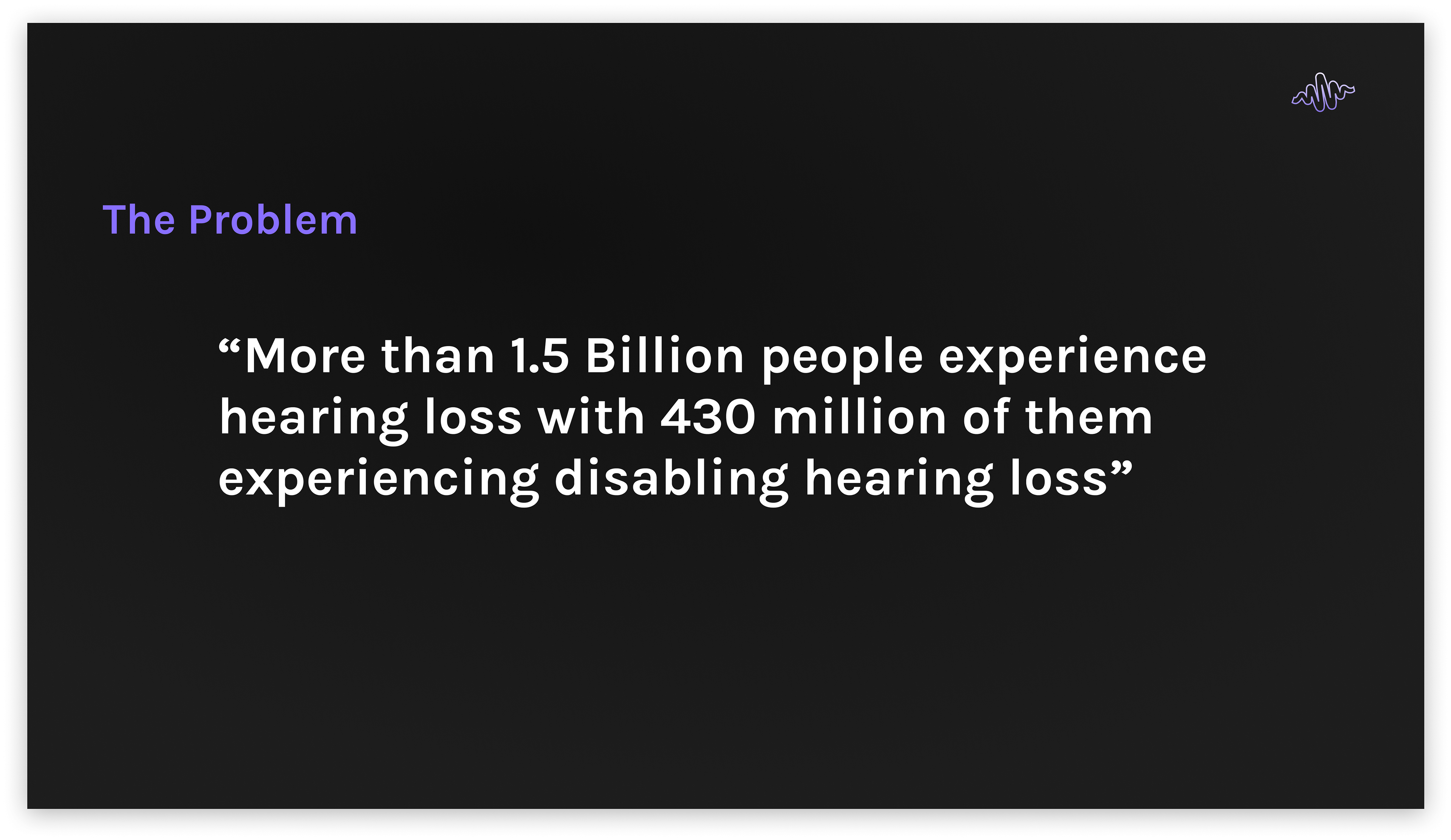
The Problem
After collaborative discussions with my team, I advocated for addressing the challenges related to hearing loss and hearing difficulties as a primary focus of our project.
Initial Solution Brainstorm
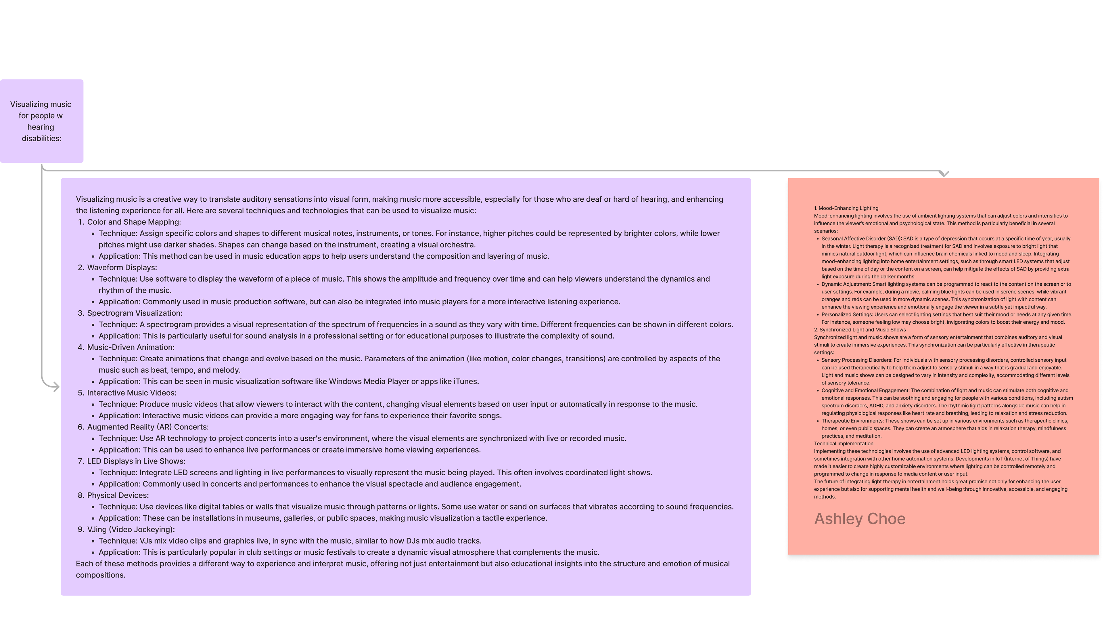
My team and I brainstormed various ways to target those with hearing difficulties through various mediums. We discussed Color and Shape Mapping, Waveform Displays, Music-Driven Animation, etc. We wanted to create a way to translate auditory sensations into visual form, to make music more accessible
Features
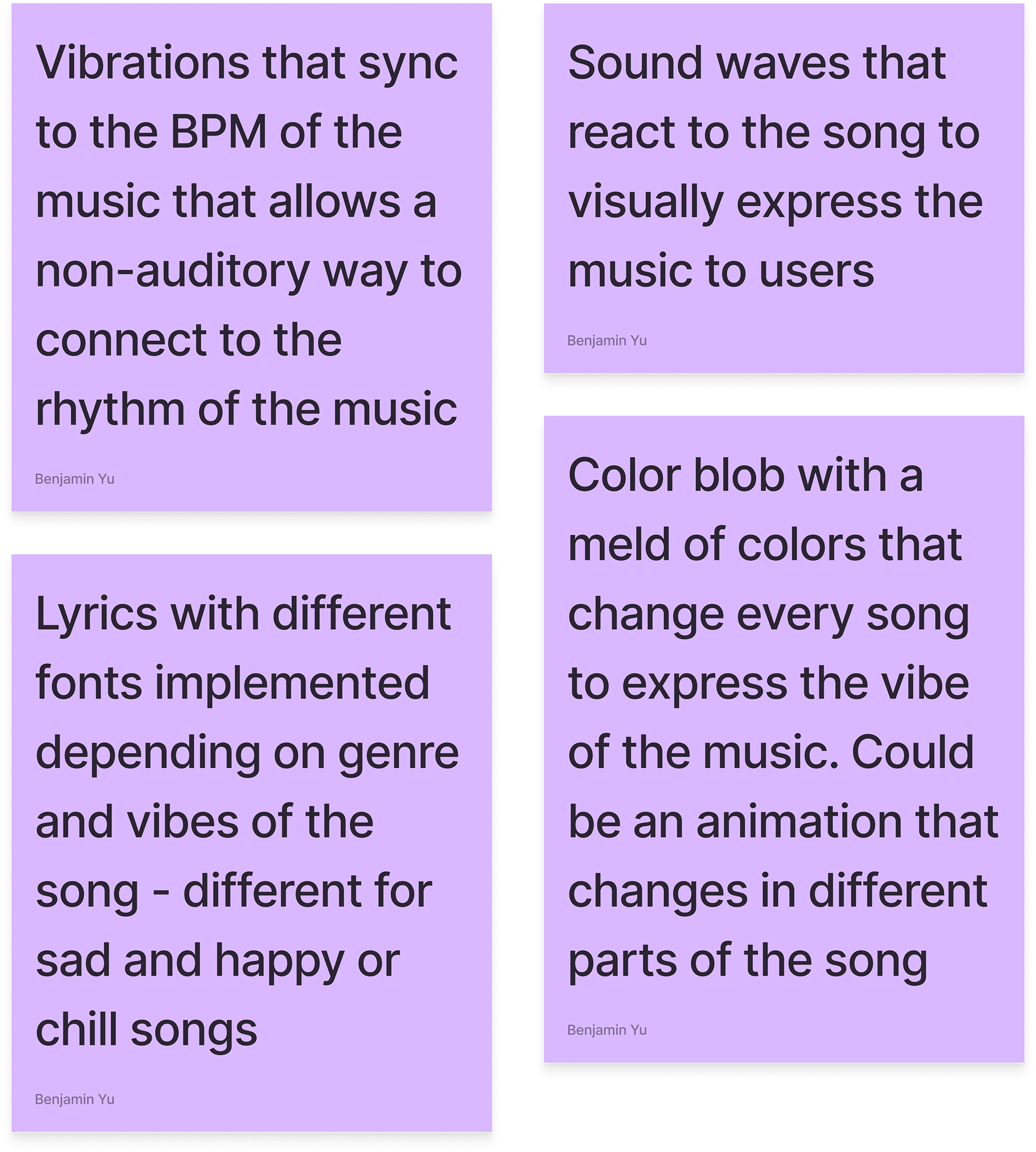
Some of the features we wanted to narrow in on, especially given our time constraint, involved
1) "Vibrations" that synchronize to the bpm of a song
2) Lyrics with different fonts depending on the song's genre and vibe
3) A color blob that melds together the different colors and auras of a song
4) Sound waves that react to the different parts and sounds of a song
User Research
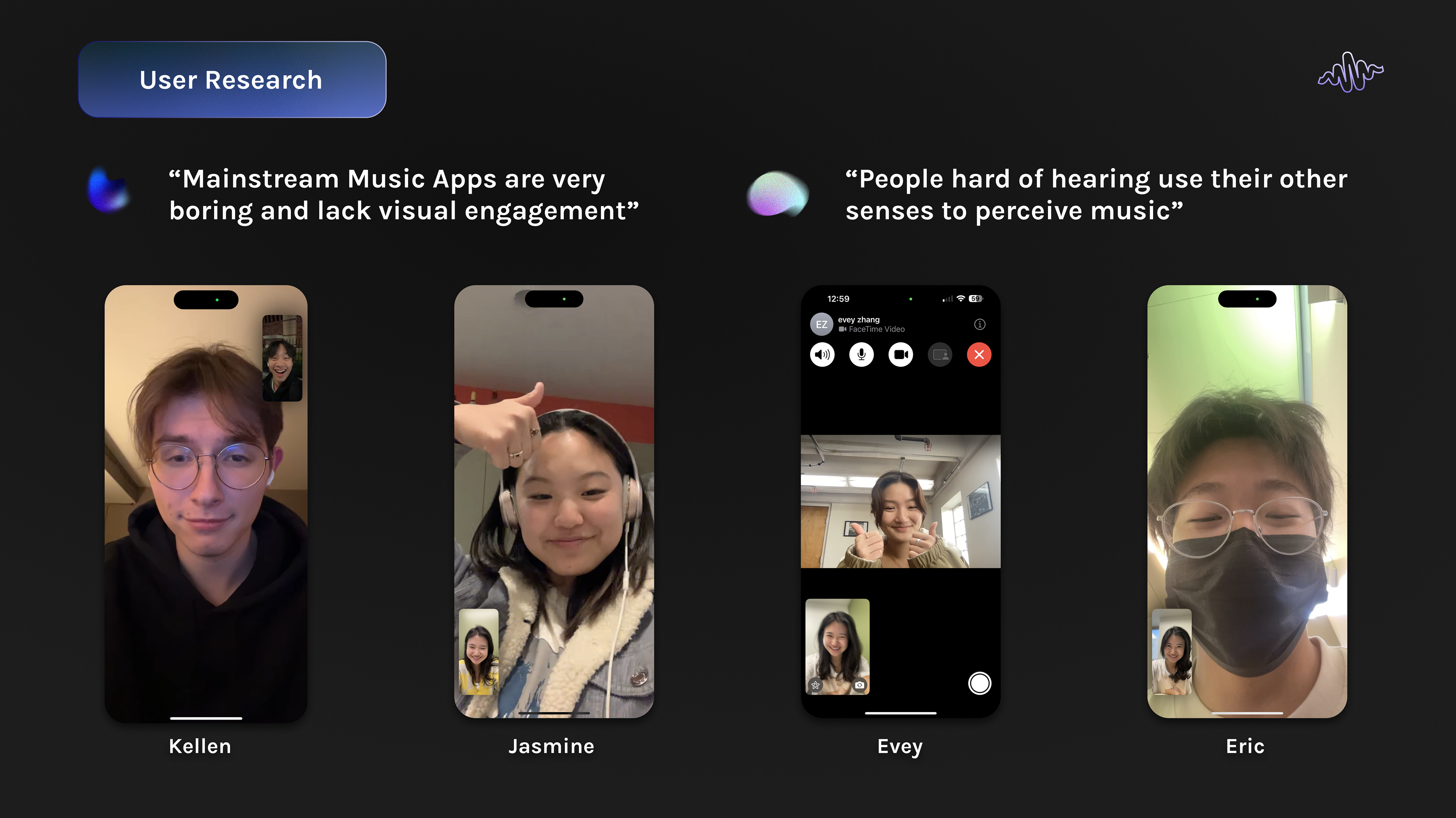
To validate our ideas, we conducted user research by reaching out to individuals with hearing disabilities, as well as general users with experience using music streaming apps, to gather diverse insights and ensure our design was both inclusive and intuitive.
“Mainstream music apps are very boring and lack visual engagement” – Several users expressed that current music streaming apps offer limited visual interactivity, making the experience monotonous. This feedback highlighted the need to incorporate more dynamic visual elements that could enhance the overall user experience.
“People hard of hearing use their other senses to perceive music” – For users with hearing disabilities, music is not just an auditory experience. These users often rely on other senses, such as touch (vibrations) or visual elements, to enjoy music. This insight emphasized the importance of creating a more inclusive design that integrates multi-sensory feedback, like visual animations or haptic responses.
Design Process

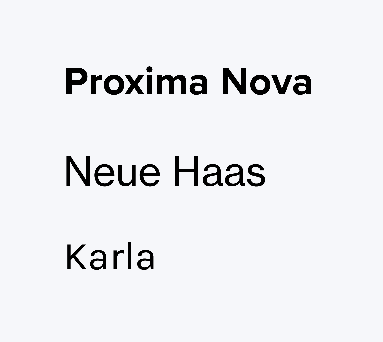
Fonts
we selected Proxima Nova, Neue Haas, and Karla as our primary typefaces for a balance between readability and a modern aesthetic.
Proxima Nova offers a clean, geometric look that is both versatile and highly legible, making it ideal for headlines and prominent text.
Neue Haas brings a sleek, contemporary feel, while maintaining excellent readability for body text.
Lastly, Karla adds a touch of warmth and character, creating an approachable tone without sacrificing clarity.
Together, these fonts support a user-friendly experience while reinforcing the modern, forward-thinking identity of the app.
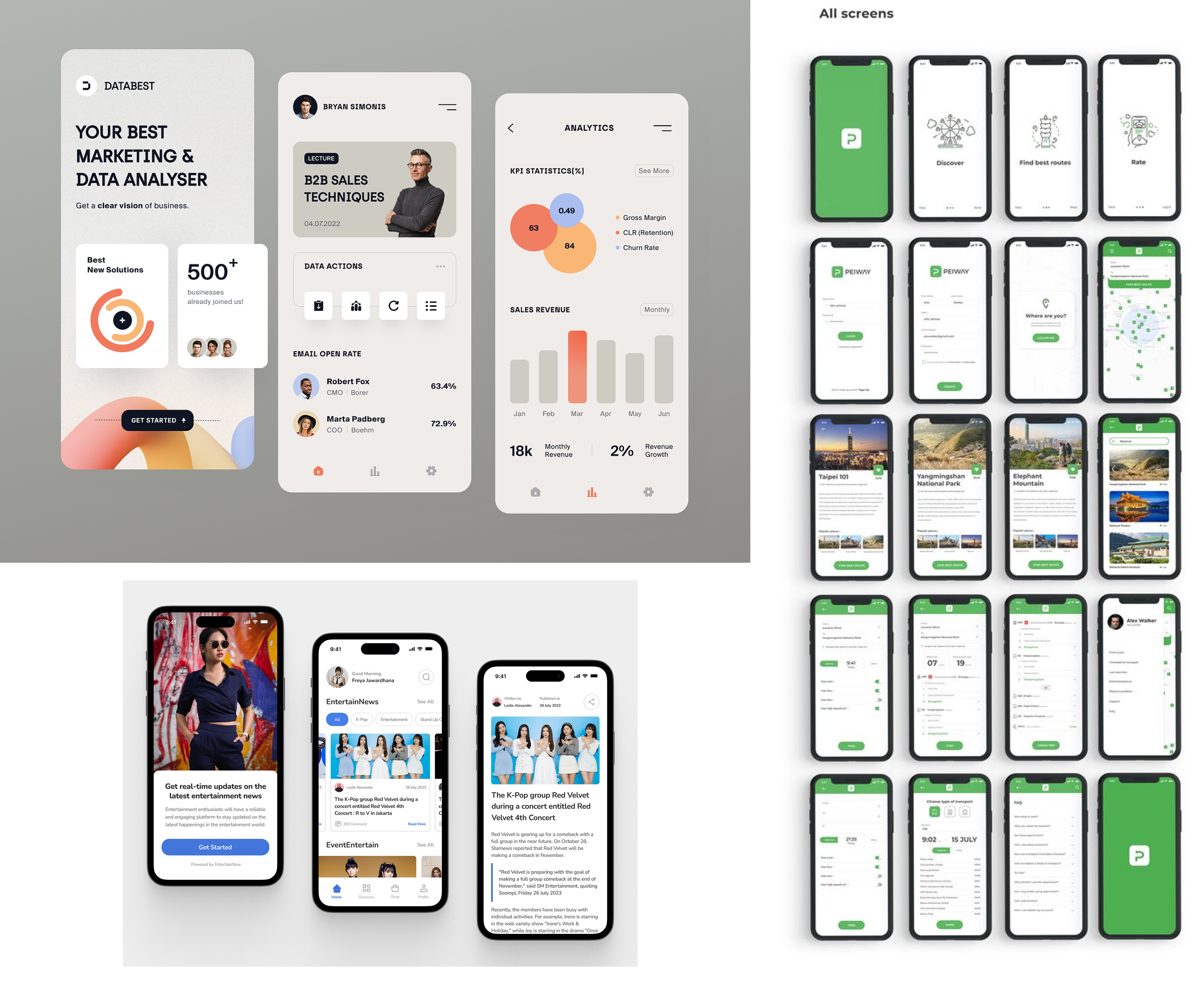
App Design Inspiration
Our app design was inspired by modern, minimalistic interfaces that prioritize clean layouts and intuitive navigation.
Mood Boarding
For our mood board, we were inspired by abstract, color blob aesthetics to create visuals that feel vibrant and engaging.
Our goal was to maintain a modern, artistic vibe that adds a sense of fluidity and warmth without overwhelming the user.
By focusing on simplicity and soft gradients, we ensured the design remained approachable and accessible, avoiding an overly tech-heavy feel while still keeping the interface contemporary and visually appealing.

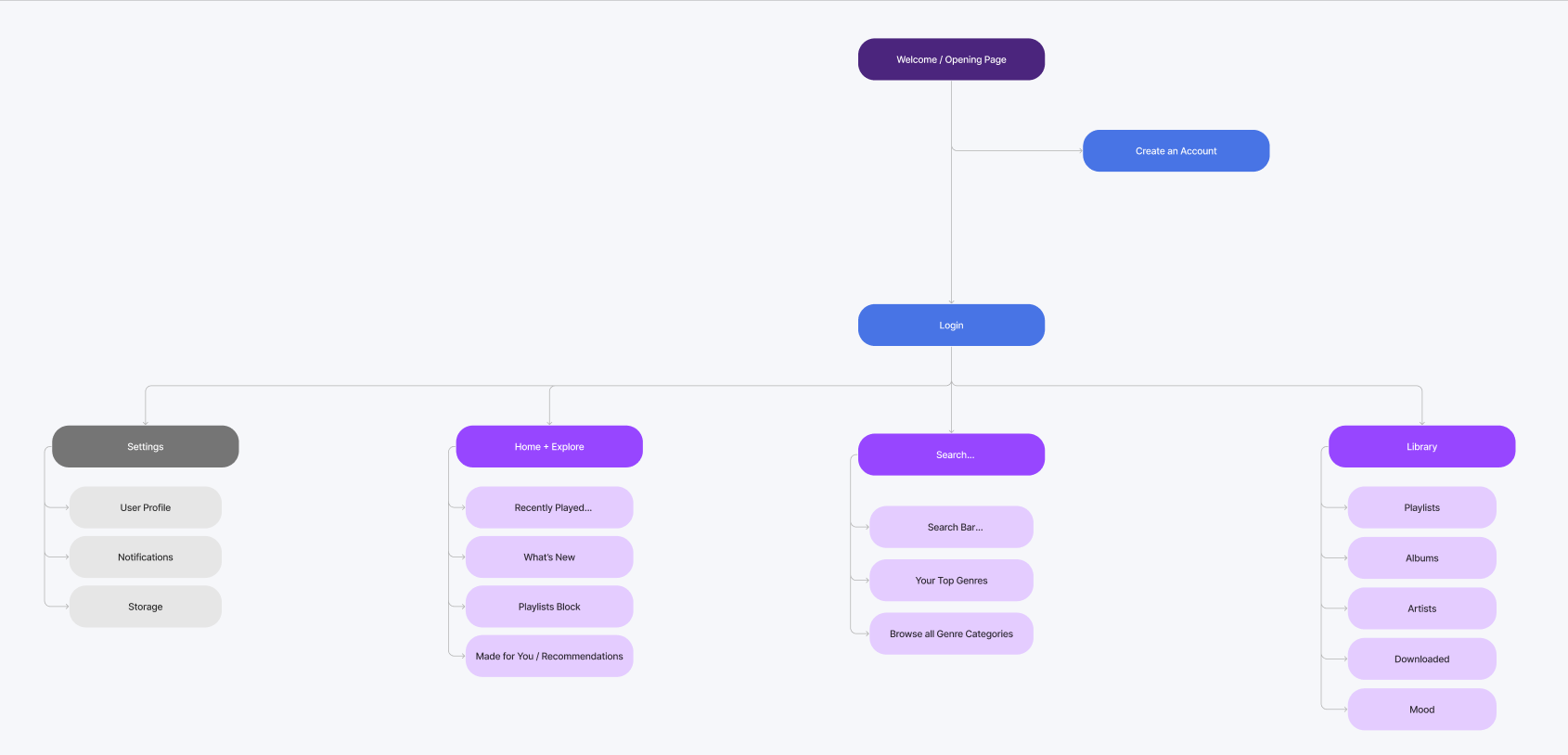
Site Architecture
The journey begins with a welcoming opening page that guides users to either log in or create an account.
Once logged in, users can explore key sections including Home + Explore, Search, Library, and Settings.
The Home + Explore section provides easy access to recently played content, new releases, and personalized recommendations based on user preferences.
The Search functionality includes a search bar, quick access to top genres, and a comprehensive genre browsing experience.
The Library houses the user’s playlists, albums, artists, downloaded music, and even a section for mood-based playlists.
Settings allow users to manage their profile, notifications, and storage.
This architecture was designed to prioritize usability, with a clear, minimal hierarchy that supports ease of access and efficient task completion, ensuring that users can navigate intuitively across different functions of the app.
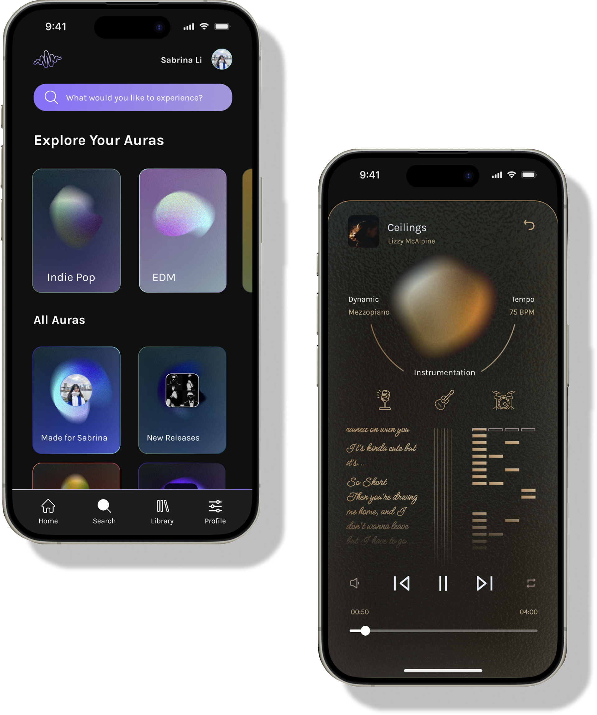
Shades Prototype
I led the design for the song and playlist cards that populated the Home, Search, Library, and Profile/Settings pages, created the layout for those respective pages, and ensured a cohesive and intuitive user experience.
Shades Slide Deck
This slide deck was presented to the CreateSC panel of judges, which included product designers from Google and Duolingo. Our presentation earned us 2nd place out of 40+ teams, along with a $500 cash prize.


